Logo and Brand Design
Marks, colour and type systems built to hold up on site, on paper and online.
- Engagement
- 30 day rolling
- Sector
- Built environment


How logo and brand design works
A strong mark is the fastest way to look like you know what you are doing before anyone reads a word. In the built environment, where trust is everything and budgets are large, a considered identity signals the same care you put into the work itself.
We design logos, colour palettes and type systems built to work everywhere your brand actually shows up: on a hoarding, a hard hat, a proposal document and a website, not just a mood board. Every project comes with clear guidelines so the brand stays consistent long after we hand it over.
A brand in this sector faces conditions most identities never meet. It gets printed on a hoarding ten metres wide, embroidered on a polo shirt, cut into vinyl on a van, reproduced in one colour on a drawing sheet and shrunk into a favicon. A mark that only works in the original artwork is not a finished piece of work.
So we design the system rather than the logo alone: how the type behaves in a tender document, which colours survive being reproduced by a sign-writer, and what the brand looks like when a project manager has to build a slide at eleven at night. The guidelines are written to be used by people who are not designers, because those are the people who will use them most.
Who Logo and Brand Design is right for
Branding is worth doing when something has genuinely changed: a merger, a new sector, a step up in project size. If the mark is fine and the website is the weak link, start with Web Design instead and leave the logo alone.
Firms that have outgrown the original logo
The mark drawn when the business was two people and one van rarely survives contact with a tender document or a fifty-person team.
Merged or acquired businesses
Two trading names, two colour palettes and two websites confuse the market. A single identity settles who you now are.
Manufacturers selling through specifiers
Your mark ends up on a product datasheet, a sample board and a drawing. It has to stay legible at every one of those sizes.
Contractors bidding above their old weight
If you are pitching for larger projects than last year, the paperwork needs to look like it belongs in that room.
The problem we solve
Plenty of built environment firms do excellent work and still look forgettable on paper, on a hoarding or on screen. A dated or inconsistent mark undersells everything behind it, and a logo knocked together in-house rarely holds up once it is stretched across a website, a proposal, a hard hat and a site board.
How we approach logo and brand design
- 01
Understand the business first
We start with what you do, who you are trying to win and how you want to be read, before a single mark gets drawn.
- 02
Design the whole system
Logo, colour palette and type, designed together so they hold up in colour, mono, small and huge.
- 03
Test it in the real world
Every mark is checked against how you will actually use it: signage, hoardings, vehicles, PPE and screens, not just a mood board.
- 04
Guidelines you can hand to anyone
Clear brand guidelines so a printer, a sign-writer or a new hire can use the brand correctly without asking.
- 05
Roll it out without a gap
We sequence the changeover across site boards, vehicles, documents and the website so you are never half-rebranded in front of a client.
One logo, from the brief to the finished files.
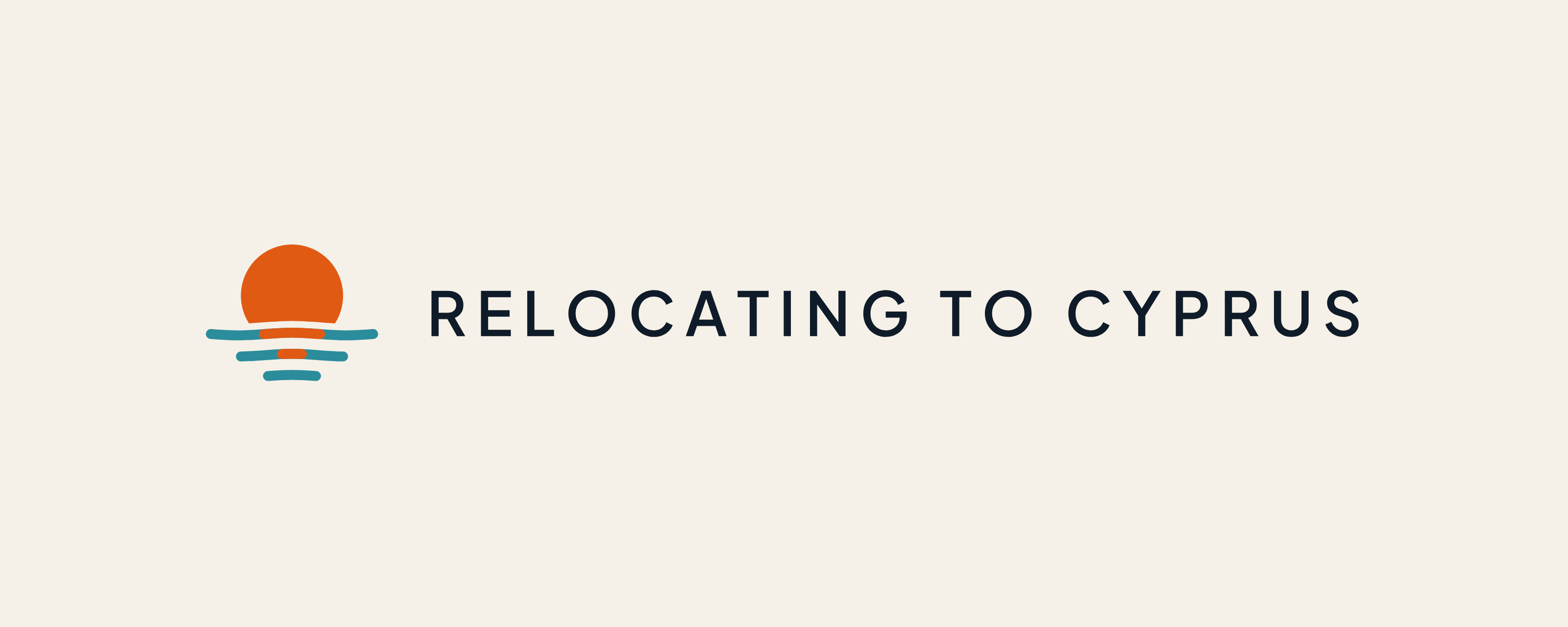
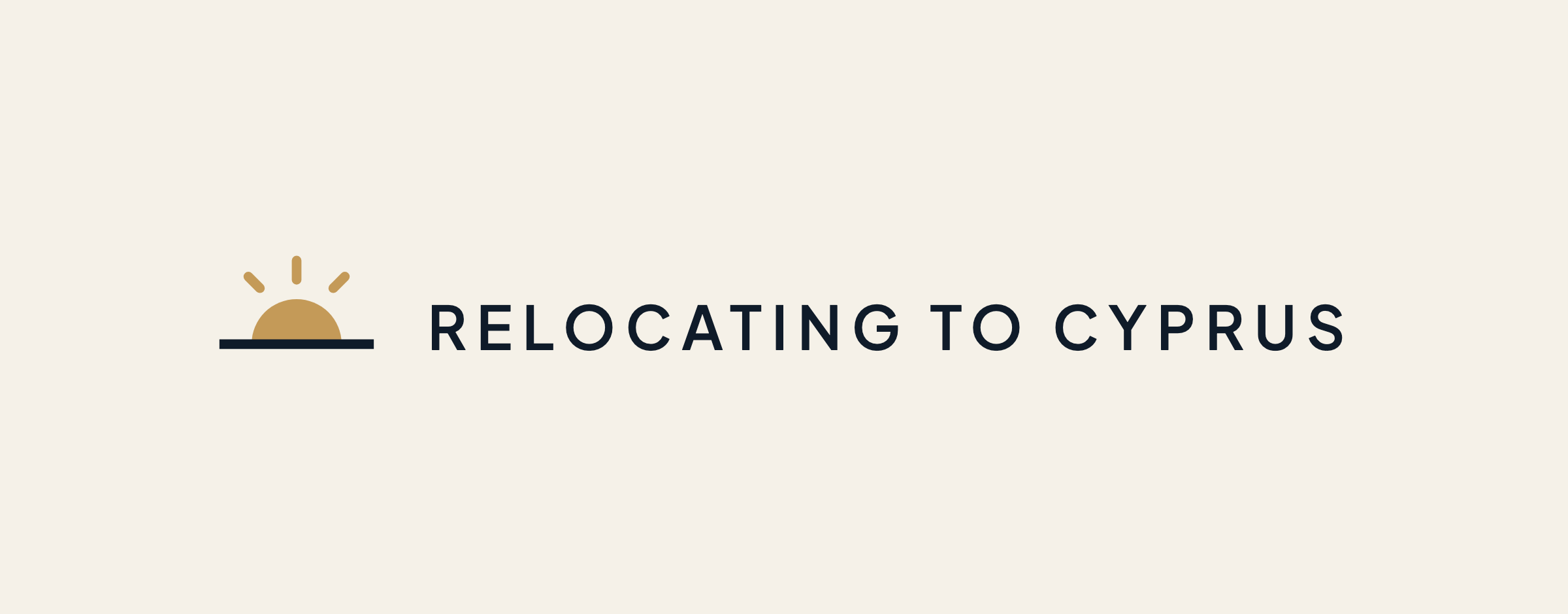
Relocating to Cyprus is a website for people moving to the island. Its first mark, a brass half sun with rays, read as a sunrise. The brief asked for the opposite: an orange sun going down over the water, most of the circle still showing, with some sign of the sea.
-
01
Understand the business first
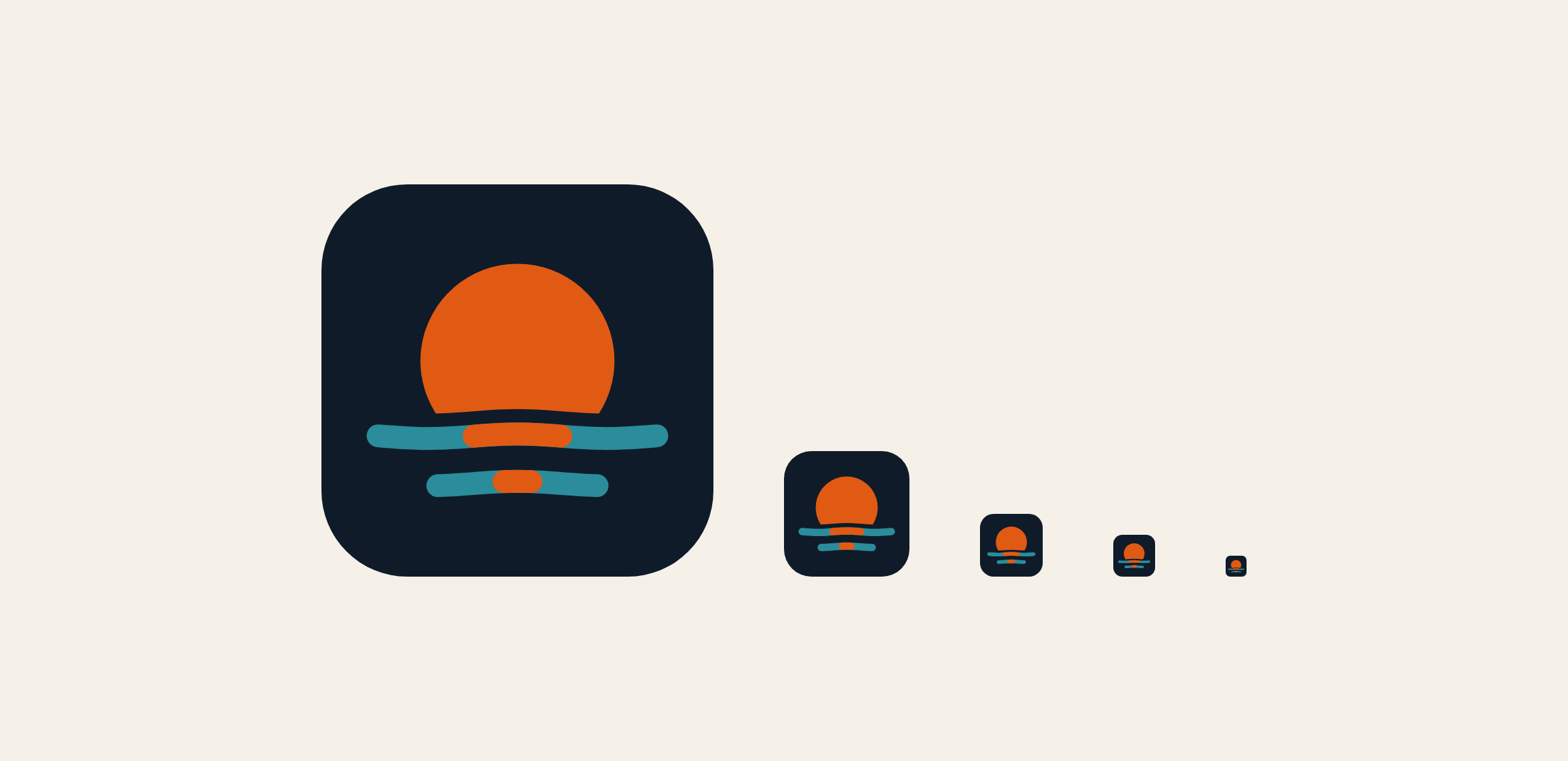
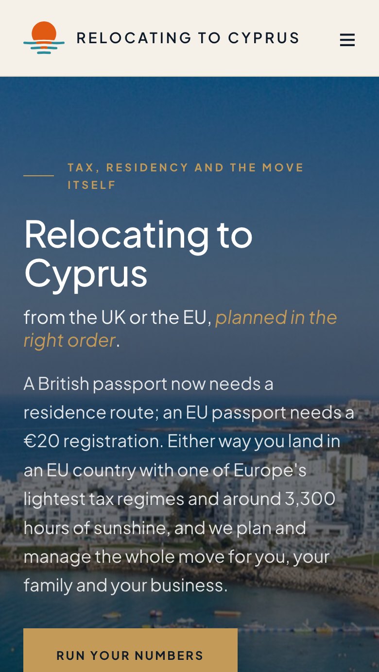
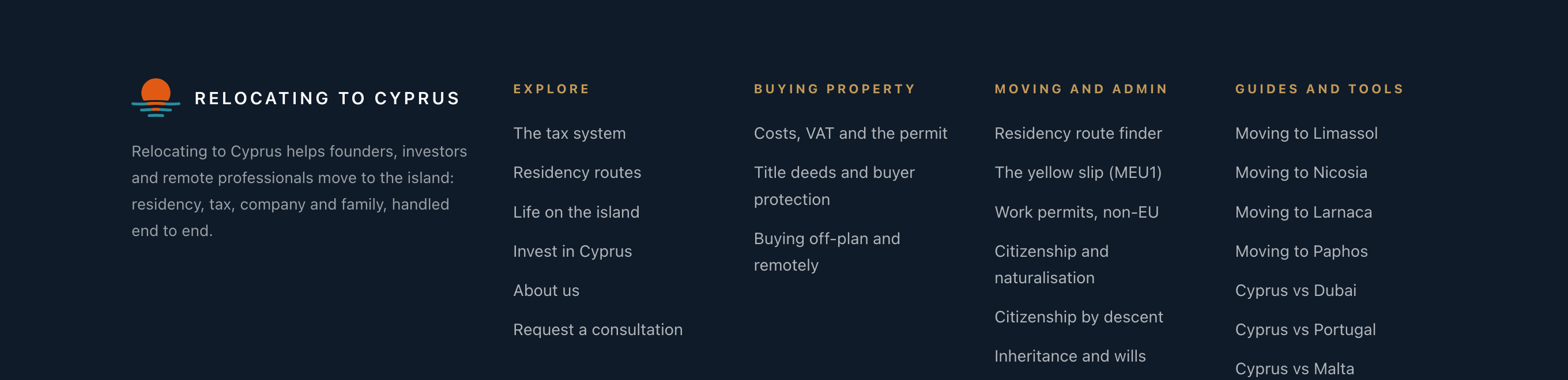
Before drawing anything we looked at where the mark has to work: a narrow header on a phone, a dark footer and a browser tab. The old one, shown here, was tidy, but it said morning and it was faint on cream.
-
02
Design the whole system
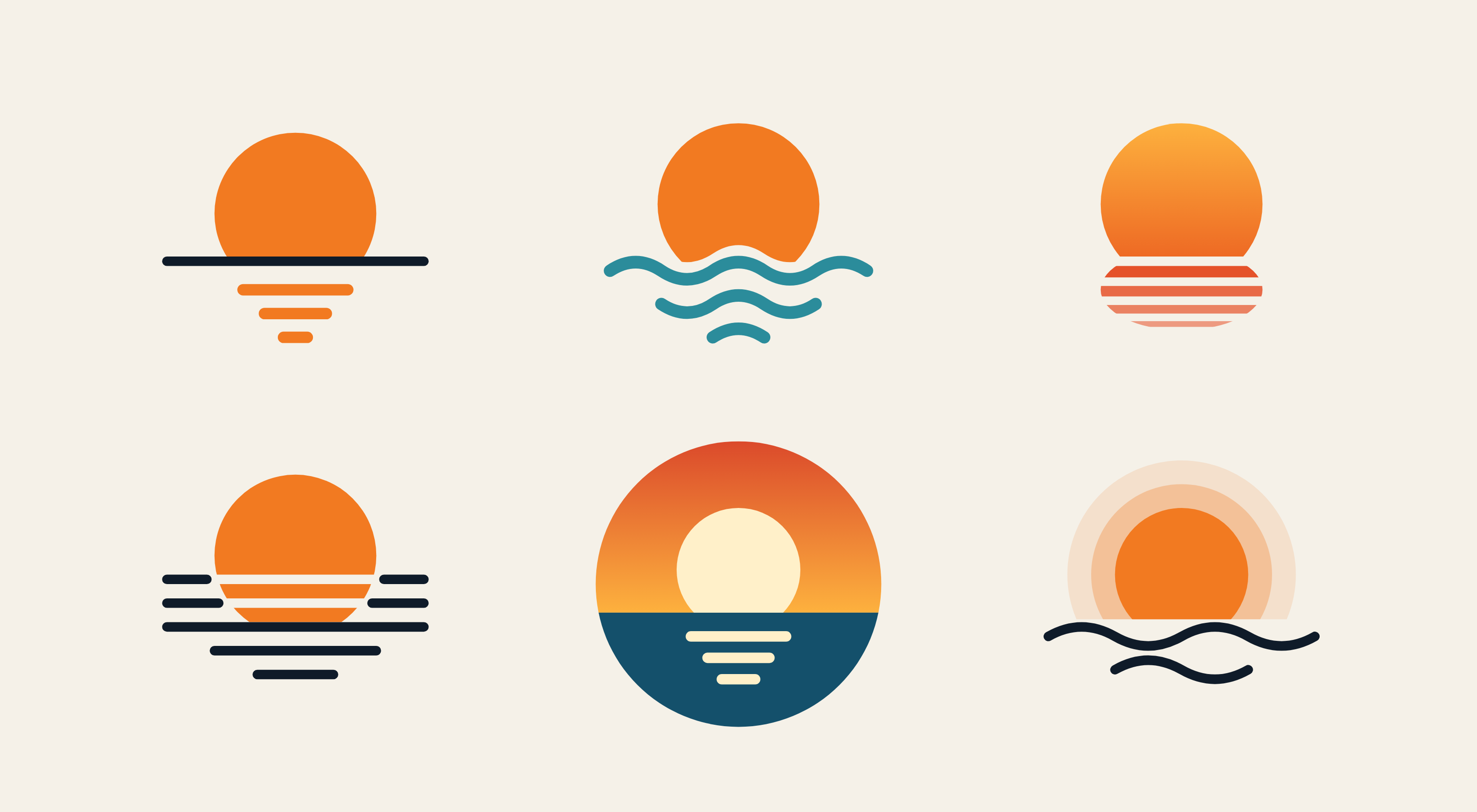
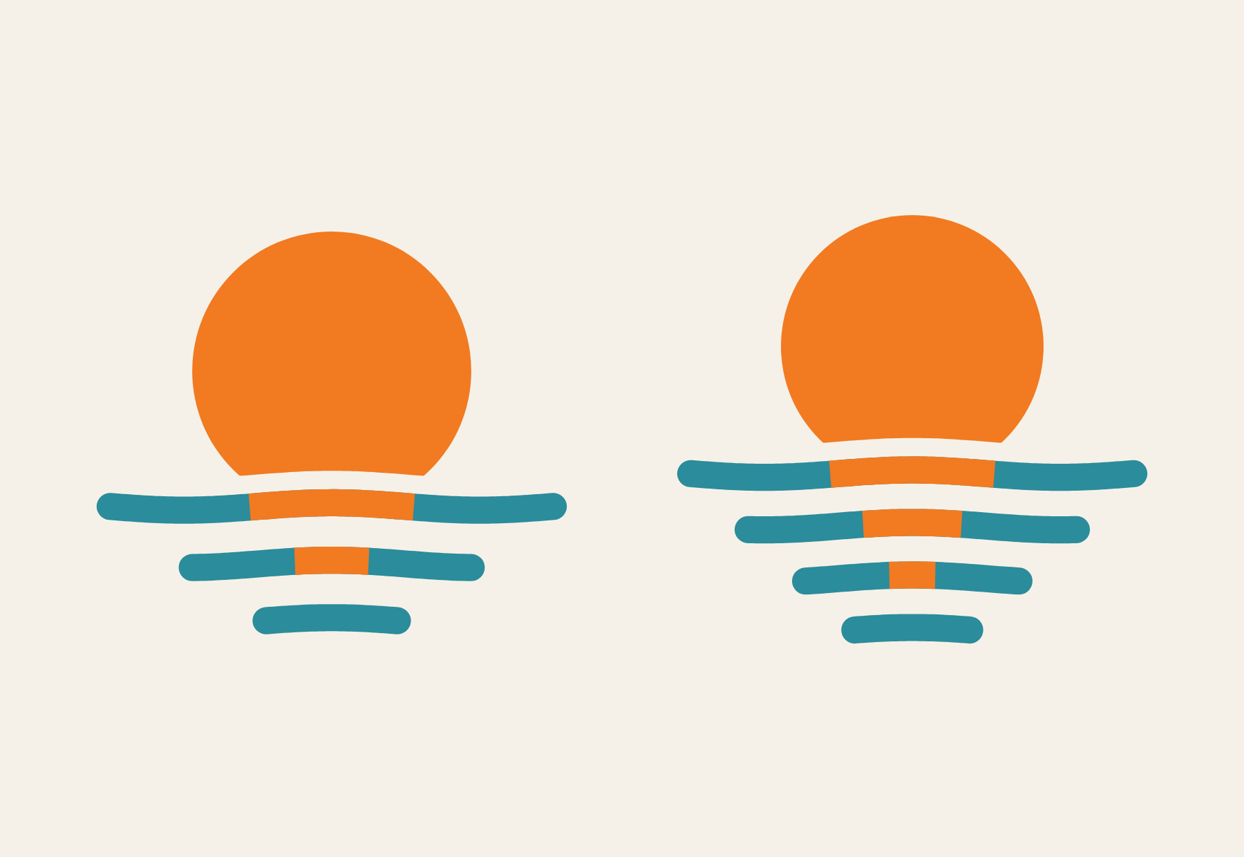
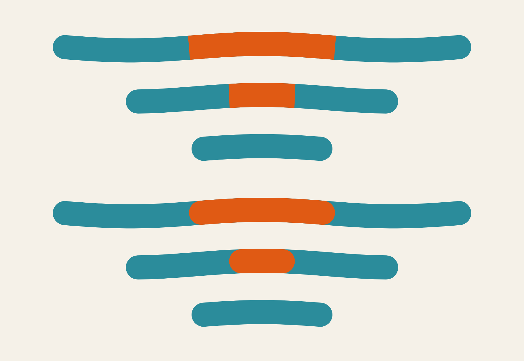
Six routes came first, each a different way to say sunset over the sea. One was chosen and pushed further: the waves were calmed until they were nearly flat, and the sun's reflection was carried into the sea as orange in the middle of the first two lines.

-
03
Test it in the real world
Then it was tested where it will be used, and each test changed the drawing.
- At browser tab size the thin lines vanished. They were made heavier, and the tab icon got its own simpler cut with two lines.
- Four sea lines were tried against three. Three held up better when small.
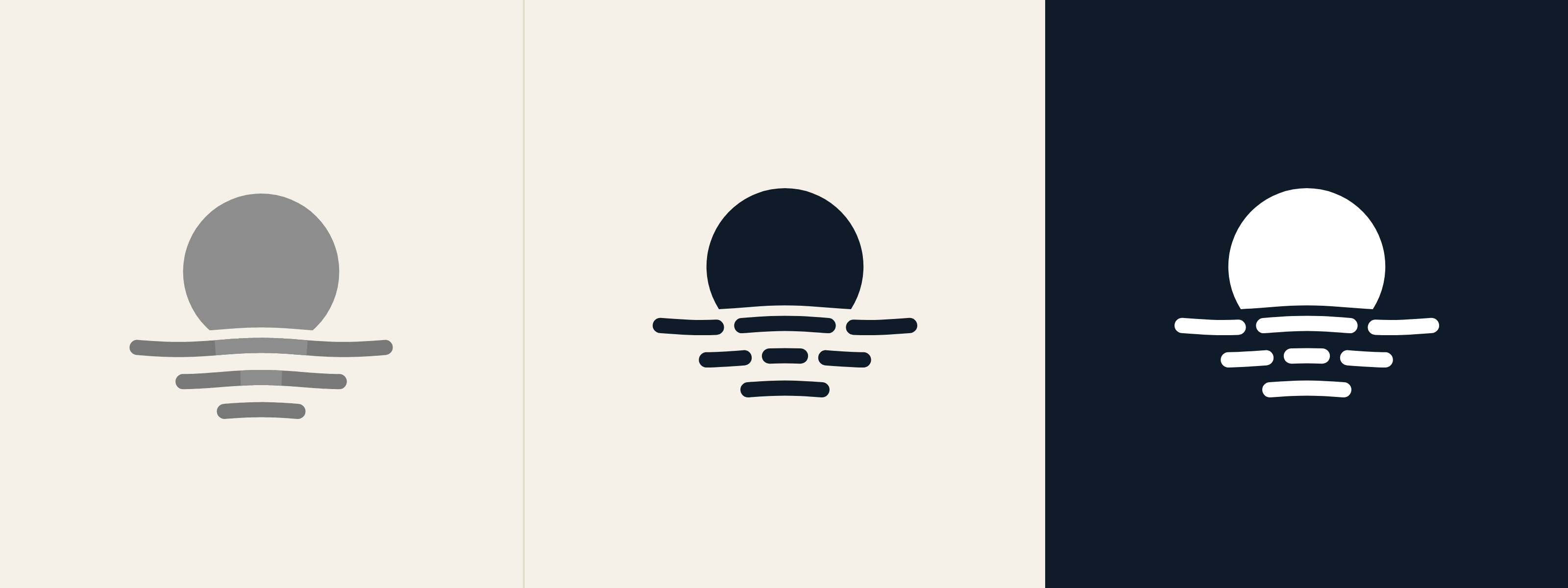
- With the colour taken away the reflection disappeared, so the one colour version breaks the lines instead.
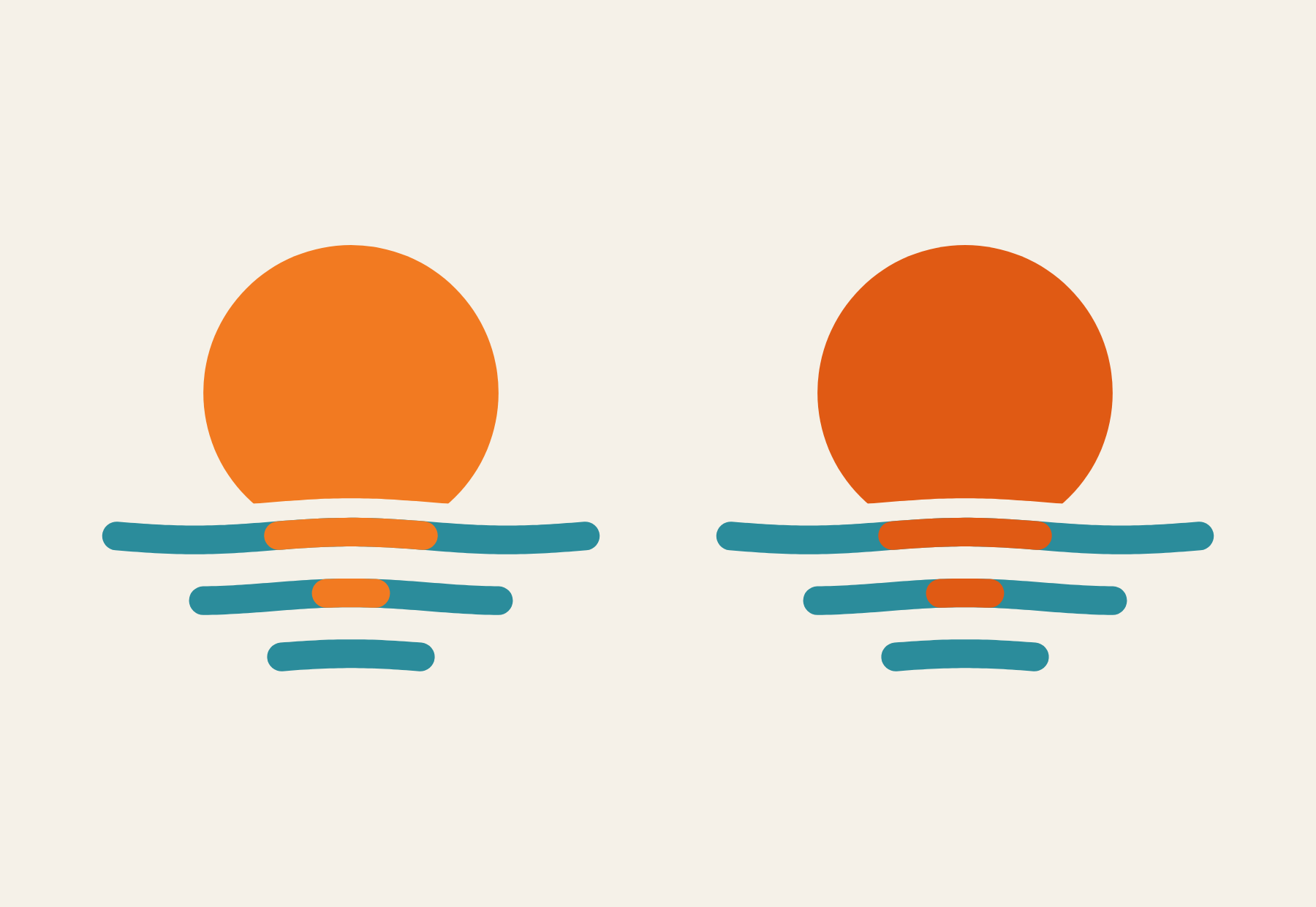
- The first orange was faint on cream. A deeper one stands out on light and on dark.
- The ends of the orange were rounded to match the ends of the lines.
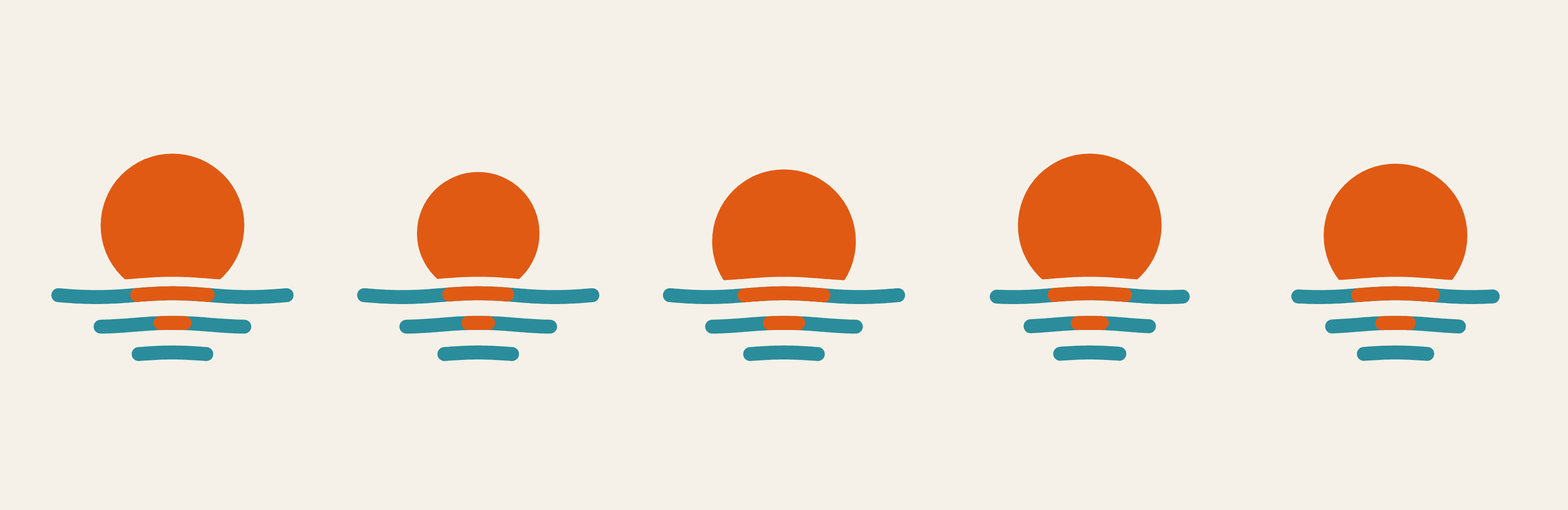
- Five positions of the sun were compared. About a quarter under the water read most like a sunset.
-
04
Guidelines you can hand to anyone
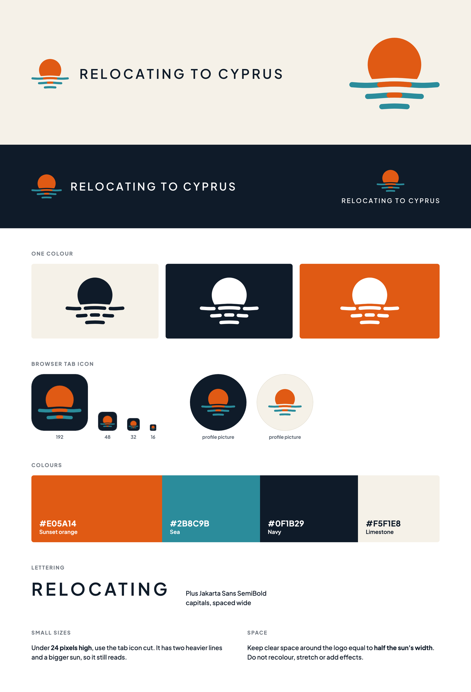
The finished logo comes as one pack: colour, one colour and reversed versions, the tab icon, profile pictures, and a single sheet with the colours, the lettering and the rules for small sizes and clear space.

-
05
Roll it out without a gap
The new mark went into the header, the footer and the browser tab of all 47 pages in a single build, so no page was left showing the old one.
See it on relocatingtocyprus.com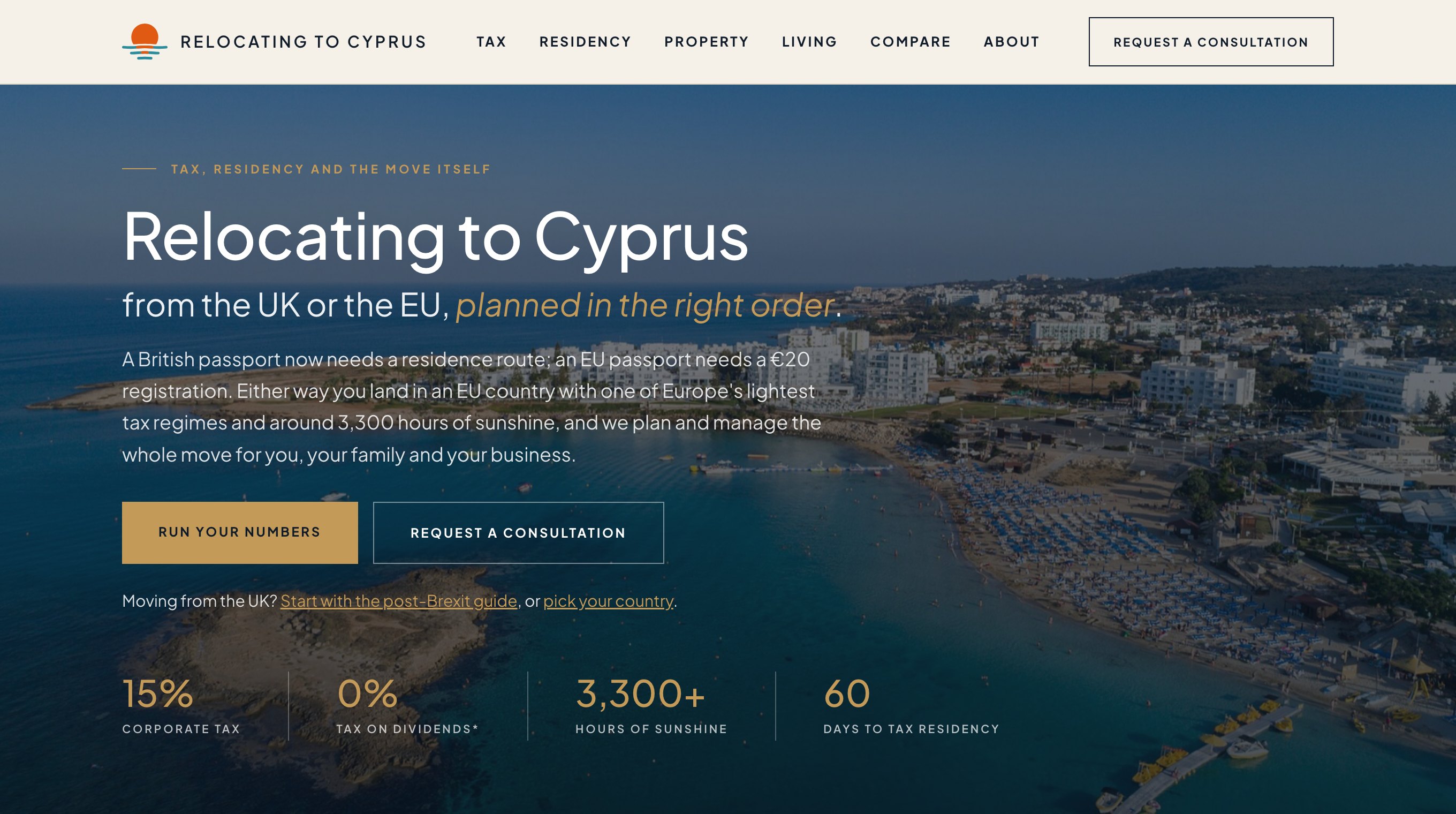
What changes
Looking like the safe choice on paper
In a sector where a bad appointment is expensive, visible care in your documents reads as care in the work.
One brand instead of five
Consistent colour, type and logo use across every touchpoint, so nothing looks improvised.
Faster work for everyone downstream
Guidelines mean a printer, a sign-writer or a new marketing hire can get it right without asking you first.
A mark that survives the next decade
Designed for hoardings, PPE, vehicles and screens from the start, so it does not need redrawing the first time you use it somewhere new.
How long does a rebrand take?
Most identity projects run six to ten weeks from kickoff to final guidelines, depending on how many applications need designing and how many people have to sign off.
Do we own the logo outright?
Yes. Full ownership of the final artwork transfers to you, supplied in every format you will need for print, screen, signage and embroidery.
Will you work with our existing logo?
Often that is the right answer. If the mark itself is sound and the problem is inconsistent use, a refresh and a proper set of guidelines costs a fraction of a full rebrand.
What do we actually receive?
Master artwork in vector and raster formats, colour references for screen and print, type licensing guidance, and written guidelines covering how the brand is used across signage, documents, vehicles, workwear and the website.
How do you handle the rollout?
We sequence the changeover so you are never half-rebranded in front of a client, usually starting with the website and documents, then signage, vehicles and workwear as they come up for renewal.
Do you design brand guidelines we can hand to a printer?
Yes, and they are written for non-designers. A sign-writer, a printer or a new hire should be able to use the brand correctly without ringing you first.
Other services
Ready to give your brand a proper mark?
Book a no-nonsense discovery call. We'll tell you honestly whether we can move the needle.
Book a growth consultationOr send a message